PETER OBI'S POSTER- The power it holds'
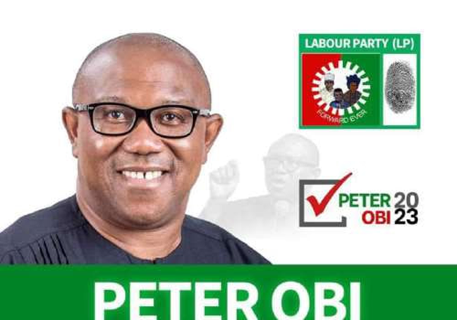
Using formal media analysis to analyze this poster. Poster are not just for picture’s sake or to carry a slogan in it. It is meant to carry an emotional note to engage with and to speak to the mind of the viewers. The poster of Peter Obi Is a campaign poster for the 2023 election in Nigeria. This poster would make for more focusing on visual elements such as color, typography, image placement, and symbolism. To analyze this the poster is designed to communicate political strength and trust alongside with unity in Nigeria. Even if the poster is simple and the colors are basic, they inform a lot to make sure they grab the attention of the audience. The design carries key messages about who Peter Obi is, what he stands for, and what kind of Nigeria he wants to lead.
Firstly, the color and
typography speak progress and Confidence and courage. One of the visual elements
used is color, which are green and white. Green and white which popularly known
as the color of the Nigerian Flag color which represents Peace and Agriculture
or nature. The red also stands out for energy and passion. This brings about the
purpose of the color, this means the poster is for all, everyone in Nigeria. He
brings in thought the people, because democracy is of the people, by the people
and for the people. Using these colors means that Obi supports National progress,
he represents passionate leadership for development and growth and peace. The
typography used in the poster plays a vital role in the setting of the poster.
The typography used in the poster are bold and clean, using capital letters to
show clarity, but deeper it means confidence, A lot of confidence to come out
to contest for an election. Also, the typography being bold helps keep memory
of the name, so that it is easy to recognize. The use of this type of font is to
make sure everyone sees it, no matter the level of education attained, it is
clear and concise.
Also, the image placement
communicate something to us looking at it in this lens. Image placement and how
it was taken says a lot. The close-up shot was used to take the picture of
Peter Obi, which shows the emotional connection to the audience. The picture of
Him smiling shows his trust worthiness to believed that he would do something
memorable and benefitable to the citizens. Also, it shows he is approachable, and
he wouldn’t do anything that would be unnecessarily rude to people. Also, the
picture is simple, and it is intentional because it shows that he is the one he
want us to see, not the noise. The image
placement, which is clear, and the picture is spelt out in the poster, shows
readiness and dependence.
Additionally, the image
poster is symbolic, how? A key feature of his posters is the use of the Labor
Party logo, a mother, father, and child. This image symbolizes the family togetherness
and furthermore, national unity. It’s meant to remind voters that Obi’s
policies will serve all Nigerians, not just the rich, or the privileged or one
region. The symbol of a fingerprint shows that the every individual has power
and that by placing your fingerprint you must select whoever you want to choose
as you leader. This approach also
highlights the social values of care, inclusiveness, and protection. By using
this symbol, the poster frames Obi as a leader who is people-centered and
family-focused. The tick sign symbolizes the vote cast of a particular
individual. So, what the poster is encouraging the viewers to vote him to being
the President.
The designs used in the
poster communicates leadership, political values and national unity. Through the combination of image, words, and
color, Peter Obi is shown as a calm, intelligent, and forward-thinking leader.
His calm facial expression, simple dressing, and slogans show someone who is
not dramatic but rather focused on results. The visual branding avoids excess
luxury or political noise, matching the way he was known for being frugal and
disciplined as former governor of Anambra State. Also, the use of colors used
in the country’s flag shows national unity, making it like it an everybody’s engagement
with the country. The use of an approachable picture for the poster shows the
kind of message anyone would one to relate with and engage with.
In conclusion, Peter Obi’s campaign poster Is not just a
poster to advertise a political candidate, but it is a visual story. Through
color and image placement and symbolism there is a story of unity, peace and unity.
The poster positions him as a relatable leader and dependable leader at that. The
one that the young Nigerians can trust and hope for a better future with.
Beyond the vote, and every other that the boldness and simplicity helped him
build an image and a movement that was visually appealing.

Comments
Post a Comment